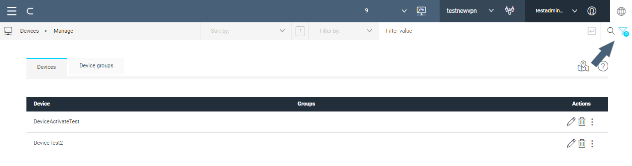
Breadcrumb bar
The breadcrumb bar displays where the user is in the navigation hierarchy (on the left side) and offers sorting and filtering capabilities that may vary from page to page. Also, a search function helps in finding desired content in a section.
Filtering
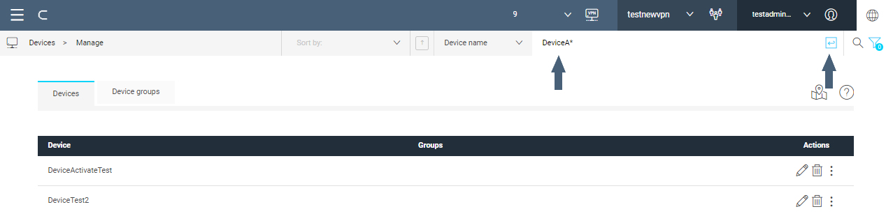
Open the filter by clicking the icon , on the right of the breadcrumb bar.
A drop-down menu containing filter attributes is displayed (Filter by) next to the edit box for the Filter value.
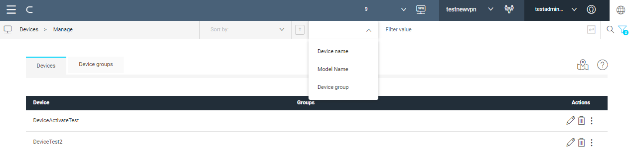
Select the property from the drop-down menu (Device name in the picture), enter the desired value (DeviceA* in the example), then confirm with (equivalent to: property = value [AND property_1 = value_1 ...]). As in the example, wildcards are supported.
The filter is displayed below the breadcrumb bar; the list of devices is restricted by the filter.
Click X next to the filter to reset the filter.
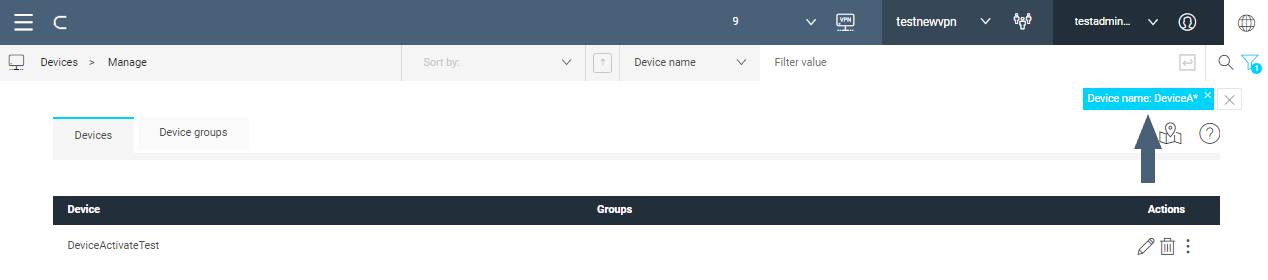
You can add more filters to narrow down the search by repeating the procedure.
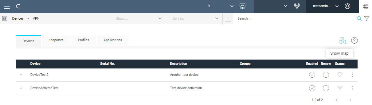
Tab bar
The tab bar hosts the tabs available in the section. On the right side of the tab bar available actions are displayed as icons. When you hover the mouse over, a tooltip describe the meaning of the icon.
The help icon is placed here for all sections.